“You can’t just change what I look like!”
(SPOILER WARNING, ON THE OFF CHANCE THAT YOU HAVEN’T SEEN THIS 1969 STORY)
I don’t know if you can cast your mind back that far, but in the 90s, colourisation of classic movies was all the rage. It was also hugely controversial, as Turner Classic Movies, added what was then a very primitive and unconvincing colour palette to the beloved likes of Laurel and Hardy and Casablanca. “These movies were meant to be seen in black and white,” the purists cried. Generally, people (including me) agreed, and the fad passed within a few years.

Fast forward to the mid-2020s, though, and the world of Doctor Who seems to have no such issues. After the 60th anniversary gave us a gaudily coloured (but effective) edit of the Daleks’ 1963 debut, this year it was the surprising choice of Patrick Troughton’s swansong as the Second Doctor, The War Games.
I say ‘surprising’ because the final Troughton story has no classic monsters like the Daleks to please the kiddies – indeed all the villains are humanoid. And yet, it does have some crucial moments for the show, most importantly introducing the Doctor’s people, the Time Lords, and ending with his forced regeneration and exile to Earth.
That regeneration was never seen on screen of course; what we got was Troughton gurning into the distance on a screen, then Jon Pertwee staggering out of the TARDIS and falling down at the beginning of the next season. One of the selling points of this new version was that it would actually depict the change – and the colour of the earlier parts would blend in well with Pertwee’s full colour debut.

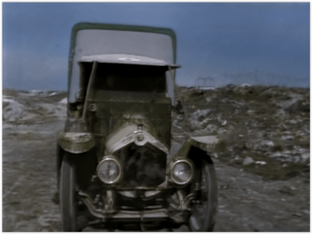
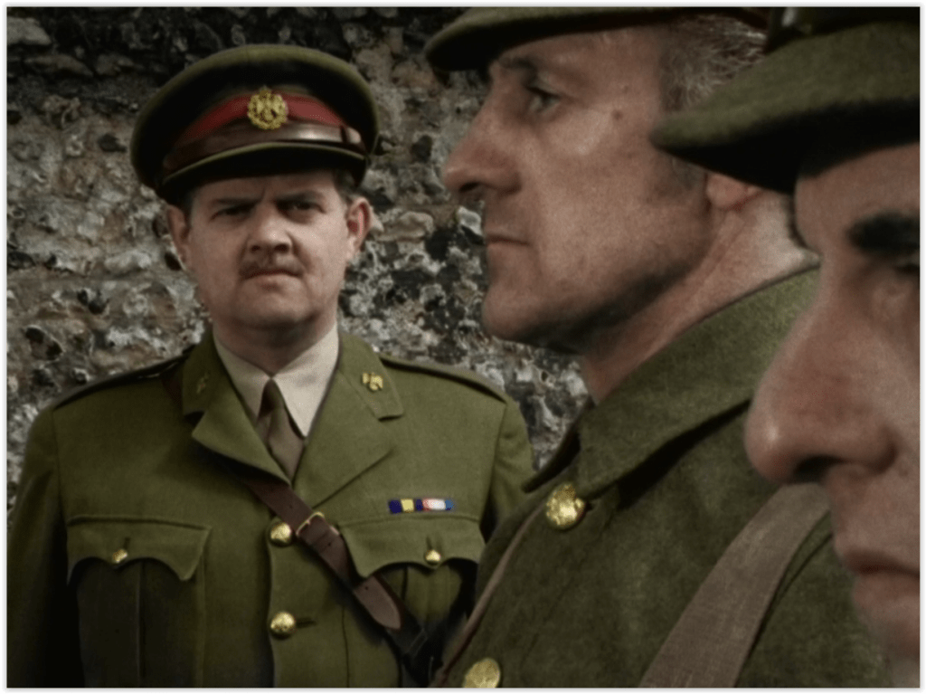
Well, it did that, although for me, it was one of the less convincing retouches to the story. The colour, though, was spot on. Unlike The Daleks, which went full-on psychedelic 60s with its garishly bright primary colours, the palette here was a very much more washed-out, pastel affair. That’s in keeping with the primary setting; after all, the First World War’s dominant colours were probably the brown of the mud and the olive drab of the military uniforms. I suppose there would have been a lot of bright red blood too, but this is Doctor Who, not All Quiet on the Western Front, so we didn’t see any of that.
Colourisation has certainly improved since those early controversial days of the 90s. You could easily believe this might have been made in colour to begin with – all the flesh tones of faces, and the greens and browns of the landscape, were totally convincing. I don’t know how much colour set photography the editors had as a reference, though there’s been some controversy about Troughton’s shirt; apparently it should be white, rather than the pale blue (presumably referenced from his appearance in The Three Doctors) seen here. Honestly, if that’s the biggest thing fans have to worry about, they have it easy.

Generally, most of the technical side was very well done. I don’t know what process was used on the picture, but the location film and studio video blended together far better than they ever did on the original, with new material shot sympathetically to match the quality. Considering that the originals only exist as 16mm film telecine recordings, what was achieved here was truly impressive – it could almost have been a modern production.
Which of course is the idea that Russell T Davies was trying to achieve. His stated aim is to try to make the older, slower Who stories closer in style to modern TV, and therefore more appealing to younger viewers who might not be so patient with a ten episode story full of filler and very long, statically shot studio scenes.

Because yes, The War Games in its original form is too long. Far, far too long. It’s understandable, though – apparently it was written in great haste by Terrance Dicks and Malcolm Hulke to replace a four-part and six-part story that fell through. Consequently, the main plot proceeds pretty slowly, vital narrative points revealed bit by bit in a seemingly endless cycle of characters being captured, escaping, and being recaptured.
So it’s certainly ripe for trimming down to its bare bones, but that, for many people, was the most controversial part. With ten episodes of material to draw on, obviously some people’s favourite parts were going to be lost; and not everyone has the same favourite part. So we didn’t get to see David Troughton (Patrick’s son) in his debut as a bit part soldier; and flamboyant characters like Mexican revolutionary Arturo Villar appeared only briefly, with no introduction except as members of the Resistance.
Generally, I didn’t have a problem with this. As a long, sprawling story, The War Games has a larger cast of characters than most, so obviously some of their roles would be truncated or removed altogether. I’ll admit, I thought it was a little incoherent that David Garfield’s villainous Von Weich didn’t get a proper introduction, leading to potential confusion as to why he was discussing manoeuvres with Noel Coleman’s WW1 General Smythe and then sending messages from the American Civil War Zone.

That’s the thing though – even with all the filler to cut out, it’s a mammoth task to reduce ten episodes of story to a mere 90 minutes, and some of the edits were more successful than others. So there’s no explanation offered as to who fired the shots that saved the Doctor’s life at his execution, or how he and Zoe knew how to find the military prison where Jamie was incarcerated. Similarly, we seem to go from Jamie beginning an escape plan with his redcoat cellmate to him being marched into the Commandant’s office with no reference to that plan (which in the original is tried and fails).
These are minor gripes though. The story generally seems to move at a breakneck pace, although that’s probably less obvious if you’re not so familiar with its original version. On effective way to speed up the material was to intercut between two thematically linked scenes, as we saw here with the ones where Jamie discusses how the redcoat got there, and where Lt Carstairs and Lady Jennifer puzzle over their fragmented memories. Cutting between these two, originally long and stagy, scenes gave the story a more modern pacing.

Also unusual for today’s audience was the original’s lack of establishing shots – this tries to remedy that with exterior views of most of the major settings. The attempts are varyingly successful; Smythe’s chateau is nicely conveyed with a twilit film shot of the right kind of house, but the modern exterior shots of Gallifrey (glimpsed only on the TARDIS monitor) look a bit too modern to fit in with the rest of it. And the less said the better about the very dodgy exterior of the unnamed aliens’ HQ. Perhaps looking like a CG Airfix kit with a painted backdrop was an attempt to fit in with the era.

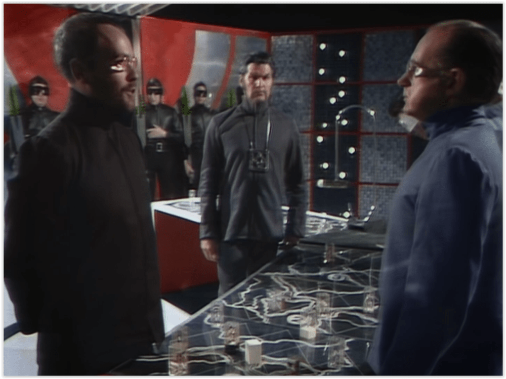
One advantage of cutting to the chase earlier than the original is that the aliens behind the whole thing are revealed much earlier, and Philip Madoc’s quietly intimidating War Lord gets a far better proportion of screen time (though tinting his glasses pink was an odd choice). The endless bickering between James Bree’s Security Chief and Edward Brayshaw’s War Chief is thankfully reduced to a minimum, but still there – it’s essential to the plot.

As to the latter, many fans have theorised over the years that Brayshaw’s renegade Time Lord is in fact an early appearance of the Master. One man here was determined to retcon that into canon – music stalwart Mark Ayres underscored the War Chief’s every appearance with either Murray Gold’s or Dudley Simpson’s themes for the Master. In case you had any doubt, these played pretty much every time he was on screen. As indeed did all the music; Ayres’ initial recreations of the original score soon gave way to Murray Gold-esque constant incidental music, even when the scene really didn’t need it. One more concession to the style of the modern show, I suppose.
But what the fans were really salivating for was the promised regeneration scene. And again, it was varyingly successful. In a perhaps predictable touch of fan service, the original sketches of the faces that the Doctor rejects were replaced with his more recent incarnations. It did blend comically with Troughton’s original protestations – Capaldi was “too old”, Tennant “too thin”, and Whittaker “too young”. Mind you, it did rather suggest that the Time Lords were offering him a chance to regenerate into them earlier than he should – surely a terrible paradox?

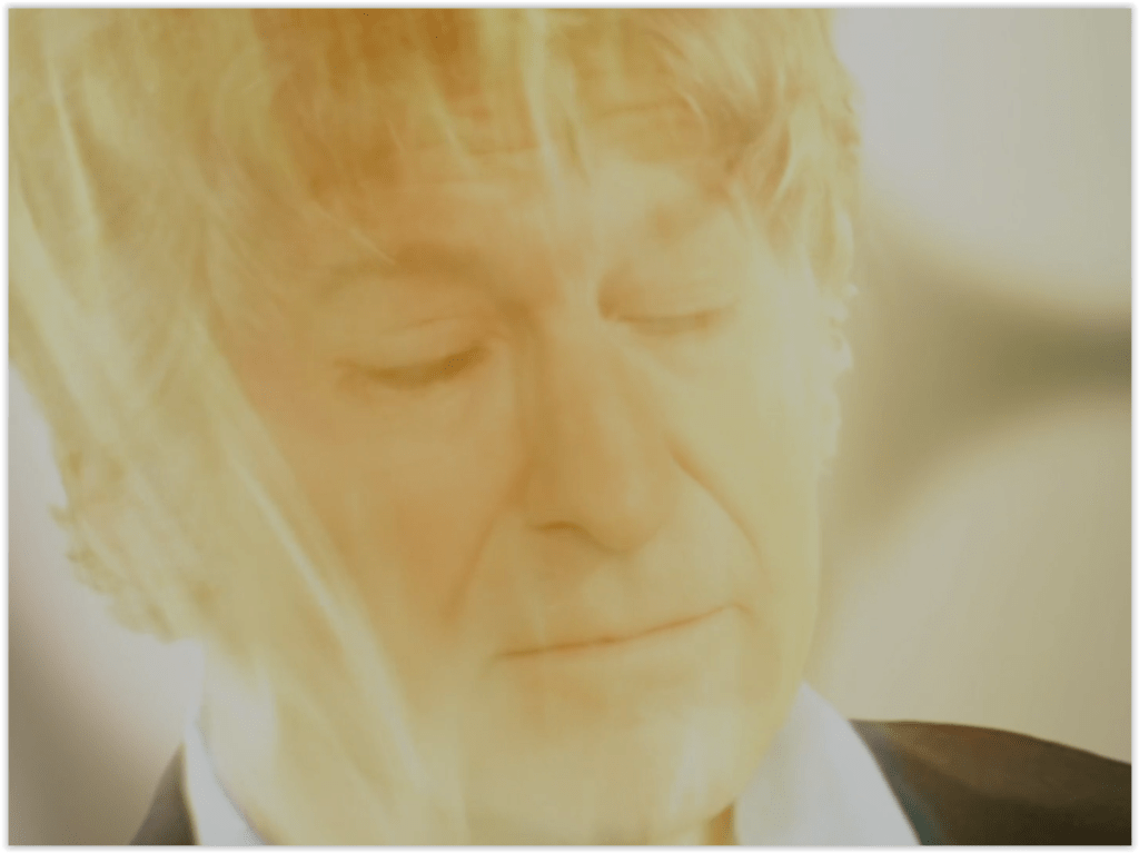
Done once more in the style of the modern show, with the golden glow of “regeneration energy”, the regeneration did at least allow the Doctor to sit down while it was happening. Obviously morphing his face into Pertwee’s was relatively straightforward with modern CG techniques, but Pertwee himself seemed to be a combination of pure CG and composited archive footage. The effect of the former was what appeared to be a Third Doctor made of plastic; which is, I suppose appropriate, given what the next story was about. The Nestene energy spheres hurtling towards Earth at the same time as the TARDIS were certainly a nice touch.
In general, I thought this was an obvious improvement over last year’s colourisation of The Daleks – the colour effect, more subtle than before, was therefore less intrusive. And the editing managed to retain most of the important plot points of the mammoth original with only a few moments of weird continuity slips. I think it possibly could have been a little longer to give the story time to breathe, but I guess that’s out of vogue with the current style. After all, RTD’s stated aim with these new versions is to give young fans of the current show a chance to watch the old stories without needing to adapt to the slower, more ponderous grammar of 60s TV. And if you are one of those fans who really doesn’t like the idea, don’t worry – the original still exists!

